Cuddle+Kind
Cuddle+Kind are a Canadian and US-based cuddly toy company on a mission to provide one million meals a year to children in need.

Cuddle+Kind are a Canadian and US-based cuddly toy company on a mission to provide one million meals a year to children in need.
Cuddle+Kind saw an immediate 5% growth in conversion rate within 30 days and an average 9.23% conversion rate growth over their first 90 days of re-launch.
Advertising profitability and ROAS improved YoY by a massive 35% whilst experiencing a relative YoY annual sales value increase of over $180,000.

Cuddle+Kind had been selling on Amazon for over 4 years but had not updated its digital assets since launching its products on Amazon. Sales performance had started to decline and they wanted to work on updating the entire Amazon portfolio to refresh the catalogue and boost sales. As a higher-priced product amongst their competitors, they wanted to ensure that the quality of their dolls and the brand’s USPs were clearly communicated in both the listing copy and the digital assets.
Our role in optimising the account was focused primarily on the design elements of over 40 products and variants on the account.
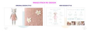
Image Stack Redesign
Original designs did not give context to the product or highlight any of their USPs. Some images were confusing and showed multiple products and variants. We also noticed that some customers had complained that they did not appreciate the size of the dolls as the images were not always consistent with the product being purchased.
Whilst each new image now had a very strong brand theme running through them, their refreshed designs also highlighted key USPs for each product, calling out some of the great features. Based on the customer feedback, we also ensured that there were size comparisons of the dolls next to young children or babies. Images now had a strong brand focus, mentioning Cuddle+Kind’s mission statement and charitable intentions.
A+ Content Redesign
The client’s original A+ Content designs utilised Amazon’s dated template system. This meant that the section was very word-heavy and not particularly engaging. The lack of imagery did not convey Cuddle+Kind’s strong brand. The result left the A+ Content feeling tired and uninspiring.
Our A+ Content refresh continued some of the themes from the image stack, providing the reader with a consistent brand experience. Our designs were very image-heavy, creating a ‘mini-landing page’ feel, dedicating space to the brand’s charitable results for children in need as well as some of the product’s qualities and features.
Cuddle+Kind saw an immediate 5% growth in conversion rate within 30 days and an average 9.23% conversion rate growth over their first 90 days of re-launch. Our designs and optimisation also improved advertising profitability, increasing YoY ROAS by a massive 35%. This increased conversion rate and higher-performing ad spend gave Cuddle+Kind a relative YoY annual sales value increase of over $180,000.


